Are you new to web development and CSS? Have you ever wondered how those nice shapes are made that you see all over the Internet? Wonder no more ... you've come to the right place.
Below I will explain the very basics of creating shapes with CSS. There's a lot to tell you about this topic! Therefore I will not cover all (far from all) tools and shapes but this should give you a basic idea of how shapes are created with CSS.
Some shapes require more "fix and tricks" than others. Creating shapes with CSS is usually a combination of using width, height, top, right, left, border, bottom, transform and pseudo-elements like :before and :after. We also have more modern CSS properties to create shapes with like shape-outside and clip-path. I'll write about them below also.
CSS Shapes - The basic way
By using a few tricks in CSS we've always been able to create basic shapes like squares, circles, and triangles with regular CSS properties.
Squares and rectangles
Squares and rectangles are probably the easiest shapes to achieve. By default, a div is always a square or a rectangle.
You set the width and height as shown in the below code. Then it's just a matter of giving the element a background color. You can have whatever other properties you want on the element.
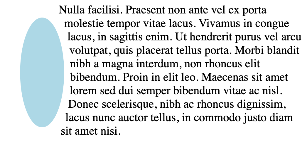
It's almost as elementary to create a circle. To create a circle we can set the border-radius on the element. This will create curved corners on the element.
If we set it to 50% it will create a circle. If you have different with and height we will get an oval instead.
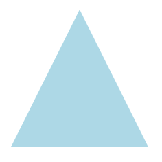
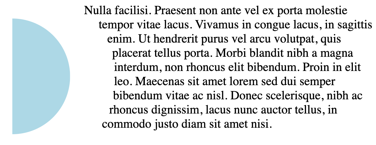
Triangles are a little trickier. We have to set the borders on the element to match a triangle. By setting the width and height to zero on the element the actual width of the element is going to be the width of the border.
Keep in mind that the border edges on an element are 45 degrees diagonals to each other. That's why this method works to create a triangle. By setting one of the borders to a solid color and the other borders to transparent it will take the form of a triangle.
If you want to have a triangle/arrow pointing in another direction You can change the border values corresponding to what side you want to be visible. Or you can rotate the element with the transform property if you want to be really fancy.
Alright ... that's basic shapes with CSS. There's probably an endless amount of shapes you can think of to create. These are just the fundamentals, but with a little creativity and determination you can achieve a lot with just basic CSS properties.
In some cases, with more advanced shapes, it's also a good idea to use the :after and :before pseudo selectors.
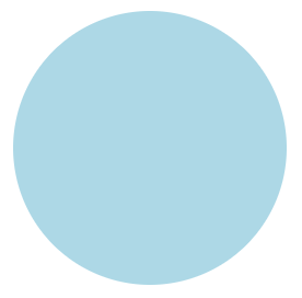
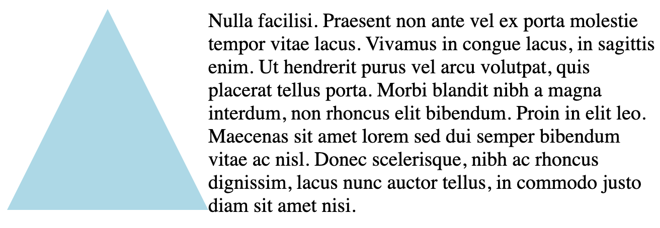
There is one big disadvantage with this approach though - ifyou, for example, want your text to flow around and wrap your shape. This is just regular HTML elements that we style and the text will not adapt and flow around your shape.
Below is an illustration showing the triangle and how the text will flow.
Luckily we have some modern CSS properties to use instead.
CSS Shapes - The other way
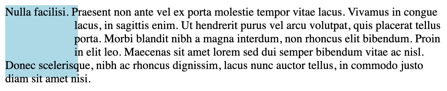
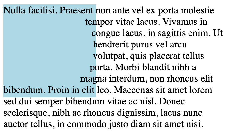
Nowadays we have a property called shape-outside to use in CSS. This property lets you define a shape that the text will wrap/flow around. To come along with this property we have some basic shapes:
inset() circle() ellipse() polygon()
Tip! You can also use the clip-path property. You can create your shape with that in the same way, but it won't let the text wrap around your shape like shape-outside does.
The element that we are going to apply the shape to has to be floated and it has to have a defined width and height. That's really important to know!
inset()
The inset() type can be used to create a rectangle/square with an offset for the wrapping text. It allows you to specify how much you want your wrapping text to overlap the shape.
You can specify the offset to be the same for all four directions like this: inset(20px). Or it can be individually set for each direction: inset(20px 5px 30px 10px).
You can use other units also to set the offset, for example, percent. The values correspond like this: inset(top right bottom left).
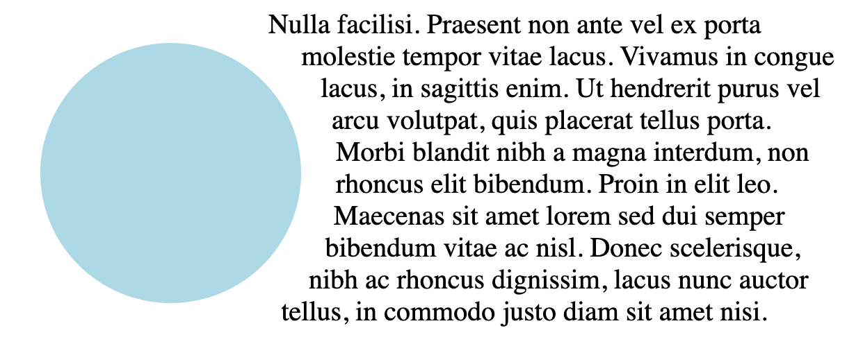
In this one a circle is created using the shape-outside property. You also have to apply a clip-path with the corresponding property for the circle to show up.
The clip-path property can take the same value as the shape-outside property so we can give it the standard circle() shape that we used for shape-outside. Also, note that I've applied a 20px margin on the element here to give the text some space.
In the above example, I don't specify the radius of the circle. This is because I want it to be as big as the div is (300px). If you want to specify your own size of the circle you can do that.
The circle() takes two values. The first value is the radius and the second value is the position. These values will specify the center of the circle.
In the below example I've set the radius to 50%. Then I have shifted the center of the circle by 30%. Note that the word "at" has to be used between the radius and position values.
I've also specified another position value on the clip-path. This will clip the circle in half as I move the position to zero.
#circle{float: left;width: 150px;height: 150px;margin: 20px;shape-outside:circle(50% at 30%);clip-path:circle(50% at 0%);background: lightblue;}
ellipse()
Ellipses work the same way as circles except that they create an oval. You can define both the X value and the Y value, like this: ellipse(25px 50px).
The same as a circle, it also takes a position value as the last value.
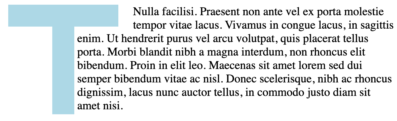
A polygon is a shape with different vertices/coordinates defined. Below I create a "T" shape which is the first letter in my name. I start from the coordinates 0,0 and move from left to right to create the "T" shape.
My name is Thomas Weibenfalk and I'm a developer from Sweden. I regularly create free tutorials on my Youtube channel. There's also a few premium courses out there on React and Gatsby. Feel free to visit me on these links:
Free Tech Daily: CSS Shapes Explained: How to Draw a Circle, Triangle, and More Using Pure CSS
CSS Shapes Explained: How to Draw a Circle, Triangle, and More Using Pure CSS
Are you new to web development and CSS? Have you ever wondered how those nice shapes are made that you see all over the Internet? Wonder no more ... you've come to the right place.
Loaded All PostsNot found any postsVIEW ALLReadmoreReplyCancel replyDeleteByHomePAGESPOSTSView AllRECOMMENDED FOR YOULABELARCHIVESEARCHALL POSTSNot found any post match with your requestBack HomeSundayMondayTuesdayWednesdayThursdayFridaySaturdaySunMonTueWedThuFriSatJanuaryFebruaryMarchAprilMayJuneJulyAugustSeptemberOctoberNovemberDecemberJanFebMarAprMayJunJulAugSepOctNovDecjust now1 minute ago$$1$$ minutes ago1 hour ago$$1$$ hours agoYesterday$$1$$ days ago$$1$$ weeks agomore than 5 weeks agoFollowersFollowTHIS CONTENT IS PREMIUMPlease share to unlockCopy All CodeSelect All CodeAll codes were copied to your clipboardCan not copy the codes / texts, please press [CTRL]+[C] (or CMD+C with Mac) to copy

![[feature] css](https://blogger.googleusercontent.com/img/b/R29vZ2xl/AVvXsEhBhbesm6uT_G50X5nGTh_kyT7NG-MY3r_I471lzWym39IfwUseZLp3O3EmT9VP51KWIm4hYkajPm7El3w2wbzv-l6wwxG4YcQJKvZjVl9oEADV6CZTtagXDJncxOMhdEWLwugFyvmzqo_x/s640/delila-ziebart-b0GSCFJ-Gzg-unsplash.png "[feature] css")


![[feature] css](https://blogger.googleusercontent.com/img/b/R29vZ2xl/AVvXsEhBhbesm6uT_G50X5nGTh_kyT7NG-MY3r_I471lzWym39IfwUseZLp3O3EmT9VP51KWIm4hYkajPm7El3w2wbzv-l6wwxG4YcQJKvZjVl9oEADV6CZTtagXDJncxOMhdEWLwugFyvmzqo_x/s1600/delila-ziebart-b0GSCFJ-Gzg-unsplash.png "[feature] css")